
Rise of the Correlations: And What it Means to Traders
By: Don Fishback
Has there been a fundamental change in the way markets behave? Is this time truly different? The short answer is — as much as I hate to say it — yes. At least it’s yes until something changes yet again. And it’s had a profound impact on option trading across the financial landscape, as well as for us specifically.
What has changed is correlation. Correlation has soared. Stocks are tied to one another now more than ever. And it’s changing the way we trade options. Actually, it’s not changing the way we trade options. It’s changing what we find when we look for option trades.
First, a little background. Correlation measures the relationship between variables. When you calculate correlation, the result is the degree to which the variables are connected to one another. In the financial markets, correlation measures how closely tied different stocks, different industry groups, different country markets, even different asset classes are all tied together.
What has happened lately is a continuation of what we’ve been seeing for quite a while now. I first wrote about correlation in a public forum on my blog shortly after I started it in January 2008. The basic premise back then was that complex systems lead to extremely high correlations when there is a shock to the system.
But that doesn’t explain what’s been happening lately. Correlation is in an uptrend. And that uptrend has been ongoing for over a decade now. Take a look at the charts for a full explanation.
This first chart shows the correlation of the daily price change of the various SPDR Select ETFs to the daily price change of the SPDR S&P 500 ETF (ticker symbol: SPY). We calculate the one-month correlation between each of the 9 SPDR Select ETFs and the SPY, and then take the average of the 9 correlations. The higher the correlation, the more connected the sectors are to one another. The lower the correlation, the less connected. Low correlation takes place when one sector goes up while another goes down. One of the most dramatic instances of this dichotomy was during the runup to the financial crisis in 2008 when the banks were weak and, at the same time, commodity stocks were skyrocketing. Remember $4+ per gallon gas?
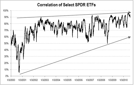
You can clearly see that correlation has been on an uptrend for some time now. It actually started from a relatively low level in the year 2000. That’s when tech stocks were getting hammered, but the S&P 500 was holding relatively steady. In fact, from the peak in March 2000 to peak in September 2000, the S&P 500 only fell -0.4%. Meanwhile, the NASDAQ fell a whopping -16.2%. Clearly they were not that connected back then.
It’s pretty obvious, however, that things have changed. Correlation between the various industry groups hit the highest level ever … at least since the industry group ETFs have been in existence. The pattern shows a series of higher highs and higher lows.
One of the concerns I have, however, is that this is a pretty limited sample. What if correlation has extremely long cycles where it rises for a decade and then falls? If that’s the case, then things are NOT that different. To answer that question, we need more data. Fortunately for us, others have done that analysis.
Because the industry group ETFs didn’t exist prior to 1998, researchers had to use individual stock prices, and compare stock price action to changes in the indexes. This next chart, which goes back to the beginning of 1987, is from Birinyi Associates. The index it is analyzing is the S&P 500 and the correlation between it and its constituent securities. Another difference between this chart and the one above is that this index is measuring the 50-day correlation, not the one-month.
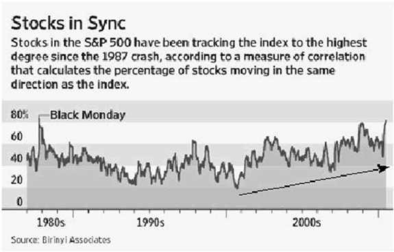
You can see that correlation has been in an uptrend since late-2000. Prior to that, however, it appears as though correlation was in a slight downtrend.
But is that an accurate reading, or is it a function of not having enough data? To find out, we’ll look at one more chart. This one, going back to 1950, is from the quants at Barclays Capital.
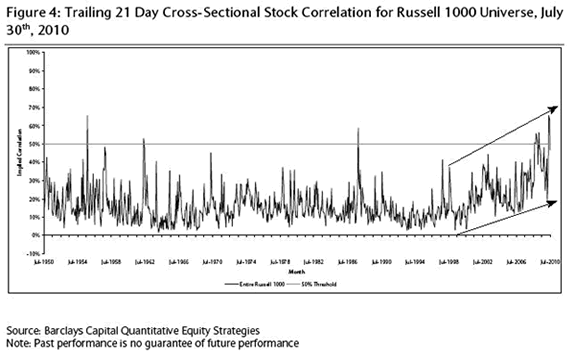
What’s clearly noticeable is how, from 1950 to 2000, correlation never really had as pronounced a trend as it has the last 10 years. Prior to 2000, you had temporary spikes in correlation. But you did not have a sustained increase in correlation as we’ve had the past decade. And while I don’t have a chart for this, the good folks at Bespoke Investment Group performed a similar analysis on the broad-based S&P Index all the way back to the 1929. [They did not analyze the S&P 500 because that index did not exist during the Great Depression.] What Bespoke found was that the current high correlation really is in rare territory, saying, “current levels are now higher … than they were in more than 98% of all other days since 1929.”
What was once a stock picker’s market is no more! It seems as though it doesn’t matter what stock you buy, because whatever it is will perform almost identical to the overall stock market.
But it doesn’t stop there. What’s even more interesting is that the rise in correlation has not been isolated to the U.S. This next chart (via Kedrosky) is from the research paper Is the Potential for International Diversification Disappearing? written by a team led by Peter F. Christoffersen. These researchers looked at correlations between international stock indexes compared to individual country stock markets.
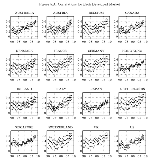
As you can plainly see, correlations across all countries are rising and have been for some time. Stock markets of developed countries are becoming more connected and to the point that they’re behaving more and more similarly. Granted, the correlations are only in the 0.6 range. But that is far higher than they were a decade ago.
At the risk of repeating myself, it doesn’t stop there! So far, we’ve looked at U.S. stocks, and international stocks. But the rise in correlation has also hit currencies, commodities and, more important to us, the options market!
Here’s an update of a chart that was in last month’s Options For Investors. It’s a graph of the correlation between gold and the dollar. Typically, these two move opposite one another. When the dollar weakens, gold usually strengthens. They have an inverse correlation; that is, their correlation tends to be negative.
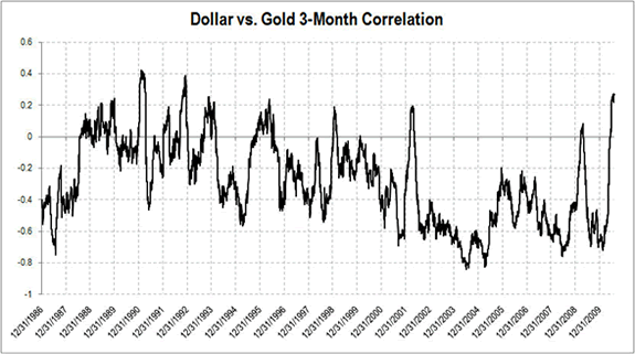
But the correlation lately has NOT been negative; it’s now positive. In fact, it’s at its highest level since 1992. Not only is the correlation between the dollar and gold in relatively high territory, it has been very rare for the correlation to ever be positive.
So why is this happening, what are the implications, and is the pattern likely to reverse?
As to why this is happening, some believe that it’s being caused by the increasing use of ETFs. They point to the timing of the introduction of ETFs and the almost coincidental rise in correlation. The premise is that instead of just trading shares of Procter and Gamble, investors are trading the Consumer Staples ETF, thus causing all consumer staples to move in unison. Instead of just trading Alcoa, they’re trading the Materials ETF, causing all material companies, including paper and rubber, to move with the aluminum and other metals stocks.
As far as the impact on the options market, one consequence has been a dearth of volume. Not only is option volume low, I was in Chicago the other week, visiting friends in the industry, and I have to tell you the phones in all of the brokerage offices were dead. One reason why option activity is so slow is because there simply isn’t any need to trade equity options. For most traders, they don’t have to trade options on PG or GE or GOOG or AAPL. Instead, all they have to do is trade an index option. High correlation numbers tell us that it’s practically the same thing.
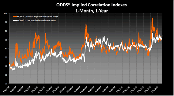
The other thing that has happened, especially to us, is that high correlation has changed what we find when we look for trades. During periods of low-to-moderate correlation, most stocks move together, but you can always find some that are out of step: some stocks go up while others go down. More important, some have expensive options, others cheap. That shows up as a low “implied correlation”. In that kind of environment, you can almost always find an option trade no matter when you look.
But when stock correlations rise, it means that either all stocks are going up, or all of them are going down. Their price action is similar. Price action is not dispersed. More important, most options tend to be priced about the same. The average implied volatility of a stock tends to converge toward index option volatility. That is reflected in rising “implied correlation” which is what this chart shows.
So what does it all this mean? I’ll let the folks at Barclays deliver the bottom line. Because it encompasses all that we’ve been dealing with for over a year. “As we have written in the past, low levels of stock dispersion [high correlation] generally correspond with difficulty in picking individual stocks. For as stocks movements increasingly coincide, the unique individual components of a stock’s story tend to shrink in importance and the common and systemic (macro) factors gain in importance.”
In other words, finding option trades on individual stocks and sector ETFs has become much more dependent on what happens in the broad stock market. The key question is, will the high correlation persist? If it does, we’ll still find trades. Just not as many.