
Trends: Price Action
By: Ellie Taft
The following is an excerpt from Ellie Taft's Dads Legacy - Blazing the Forex Trail to Your American Dream
Let’s start by taking the “technical” out of technical analysis. Simply put, technical analysis is an easy way to view market activity using pictures. You’ll be amazed by the way charting a market’s price action will give you a clear picture of where the market is, where it has been, and where it is likely to go.
If you are a veteran trader, please bear with me for just a moment. Before I get into the specifics, I need to explain a few core concepts for the benefit of those who are new to trading.
What you’re about to read is known as “Dow Theory”, after financial expert Charles H. Dow (1851 – 1902). Each time-tested concept is widely accepted and irrefutable.
How to Read Daily Bar Charts
Open: First price traded during the day; Indicated by the left-hand horizontal line.
High: The highest price traded during the day; Indicated by the top of the bar.
Low: The lowest price traded during the day; Indicated by the bottom of the bar.
Close: The last price traded during the day; Indicated by a right-hand horizontal line.
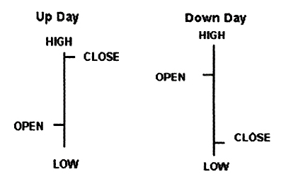
Since Forex is a 24-hour market, either New York’s closing time of 5 PM or midnight EST is generally considered closing time for charting purposes. Since the market doesn’t actually close, the opening price is the same as the previous day’s closing price.
Core Concept #1: Market Action Reflects All Information
Currency markets are influenced by a host of economic indicators such as: unemployment numbers, gross domestic product, Fed announcements, etc. But if you tried to figure out the impact of each bit of news, you’d be playing catch up… and you’d lose.
As a chartist, you don’t need to worry about why there is a price change. You’re only interested in the direction of the change and how far each move may carry you.
Core Concept #2: Prices Move in Trends
An “Up Trend” is a series of higher Highs and higher Lows. A “Down Trend” is a series of lower Highs and lower Lows. And a “Sideways Trend” is a choppy series of Highs and Lows.
Prices move up, down, or sideways until outside information and influences change the trend. Then, the new trend will remain in effect until different news or other influences appear. It is the momentum of trends that allows us to profit from ongoing market activity.
Core Concept #3: The Same 3 Phases of Trend Repeat Over and Over Again
A new cycle begins when savvy insiders recognize that a recent downtrend (uptrend) is coming to an end and start buying (selling). This is known as the Accumulation Phase.
After a while, the public begins to take notice. Price escalates as more investors get involved. What suddenly appears to be a runaway market hits the news and momentum builds. This is known as the Public Participation Phase. As the end nears, every “Joe Blow” is jumping on the bandwagon with feverish greed.
Meanwhile, traders who got in during the Accumulation and Public Participation Phases get ready to take profits. Ultimately, the last buyer is in. With no new buyers, the bubble burst and the “first sale” begins. This is called the Distribution Phase.
In the chart below, each bar represents a full week’s activity. But the same consolidation – trend – correction pattern can also be seen on a daily and intra-day basis.
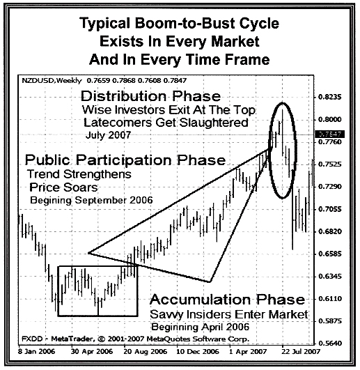
Many traders spend hours a day watching for the progress of this familiar pattern on charts where each bar represents an hour or less. I’m only willing to spend a few minutes a day trading, so I use daily charts. But, the principals are always the same.